(This post originally appeared on the “Hargrett Hours Project” Blog. Find Original Post Here)
It feels like two weeks have passed since the start of the semester, but it’s already over. I can hardly believe half of what’s happened- really, New York, I can’t believe that we actually went to New York- and it feels less real now that the semester is wrapping up.
February’s highlight was the Morgan, March’s was remembering that we had been in the Morgan, and April brought the sweet, torturous stress of the Spring 2018 CURO Symposium. As someone who’s terrified of public speaking, there’s an unspeakable fear that goes hand-in-hand with the excitement of telling other people about my research. I know my stuff, if not like the back of my hand, then at least the way I know the pattern in the creases of palm.
That aside, the symposium really did go just fine. The SAMLA paper I gave in the Fall definitely helped me guess at what to expect, though the experience of giving a power-point presentation as opposed to reading from a paper does leave some things to be missed within the definite structure of pre-written, visible words. My biggest struggle in preparing the content for the presentation was deciding exactly what would be worth including for a group of people who would likely have no prior knowledge of the kind of material I intended to show. I settled for the barest skim across the surface, which is slightly dissatisfying after having spent so much time within deep dives.
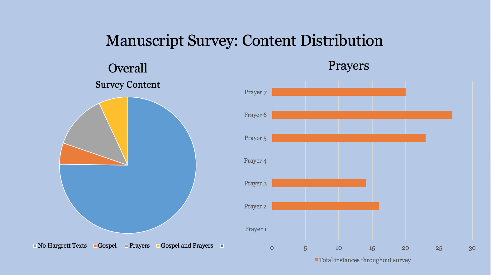
Approaching my research from the perspective of an outsider definitely did have its advantages. Enter: graphs!
Being able to articulate visually the contents of our frightening survey- I get the chills whenever I think about excel spreadsheets now- is incredibly satisfying. For comparison: this NEAT AS HELL PIE CHART and BAR GRAPH
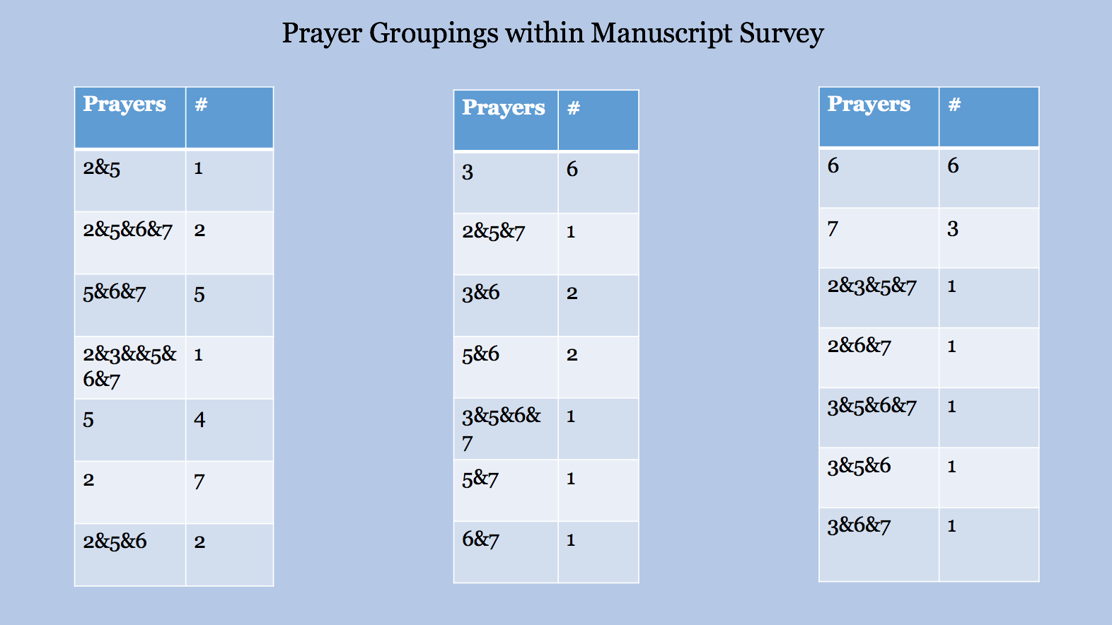
and this LOVELY SET OF CHARTS
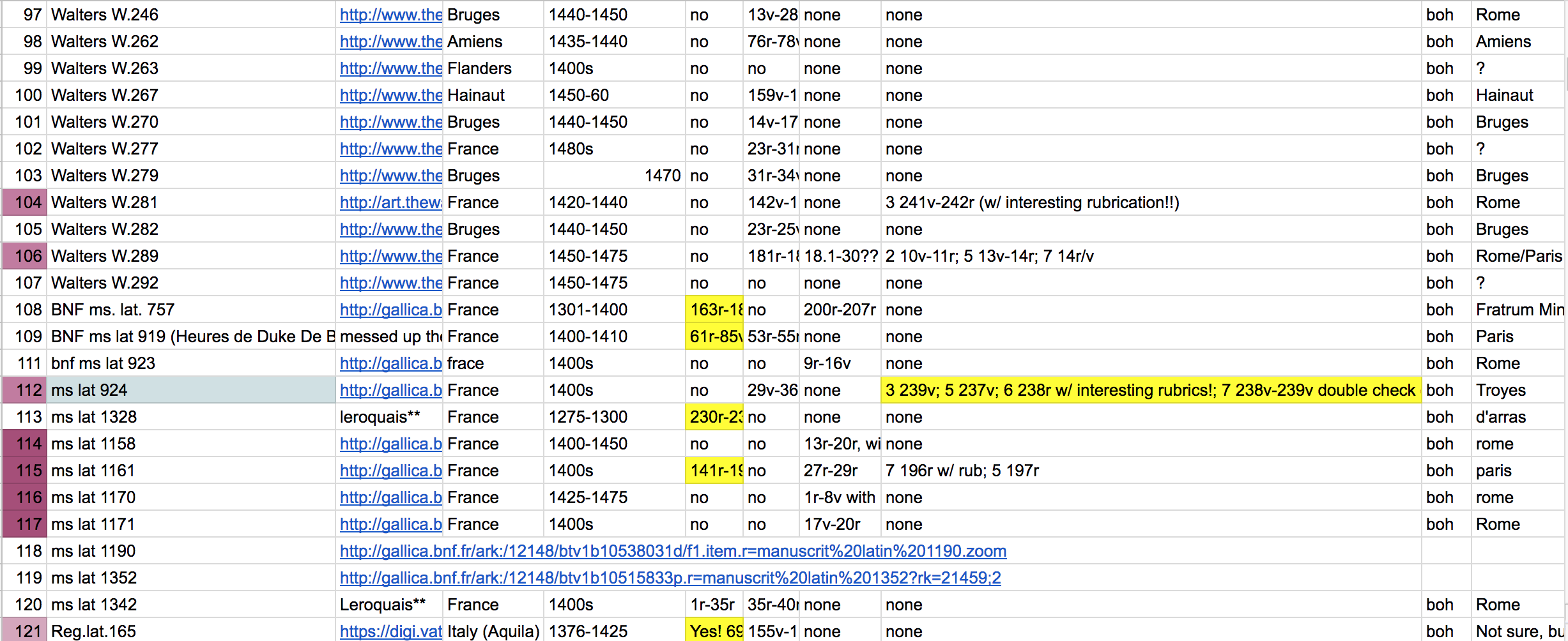
vs just a sliver of the body of our survey.
Makes sense, yeah? Having the prayer groupings up on a large screen also gave Dr. Camp the opportunity to point out their importance, especially for the manuscript with every prayer except 1 and 4, which have been notoriously elusive throughout this project. That manuscript is Walters W. 197, by the way. The calendar doesn’t have the feast days specific to Sainte-Chapelle, but its devotional sequence is impressive. It contains John’s (18 mostly, highly abbreviated) followed by prayer 2 “Deus qui manus tua et pedes tuos…”, with 3, 5, 6, and 7 later dispersed throughout other more standard prayers. There’s more to the groupings of these prayers, but I’ll get to that in depth in my next blog post.
I stuttered though the presentation and definitely forgot to cover few points because the talk was three minutes shorter than every single practice run (I don’t remember what I forgot to say, as is the nature of forgetting, but this loss in time was likely exacerbated by how quickly I talk when I’m nervous- public speaking makes me incredibly nervous). When talking about the history behind prayer 6’s rubric, I mixed Pope Boniface with King Philippe IV with King Louis IX/Saint Louis so many times that I had to stop talking for a few seconds in order to string together a coherent sentence, but that blunder was met with kindness by the small group enduring my presentation. It was, all in all, not a failure. It might even be considered a success! A relative success, rather.
Following the presentation, I had intended to treat myself to a glass of wine for a job adequately done but was so dizzy from the nerves that walking was difficult. So. I kicked off my fancy (read: from Target) presentation heels and sat in blissful peace. Everything following that lull in work will be addressed in due time.
See you soon!
~Katie